Explanation
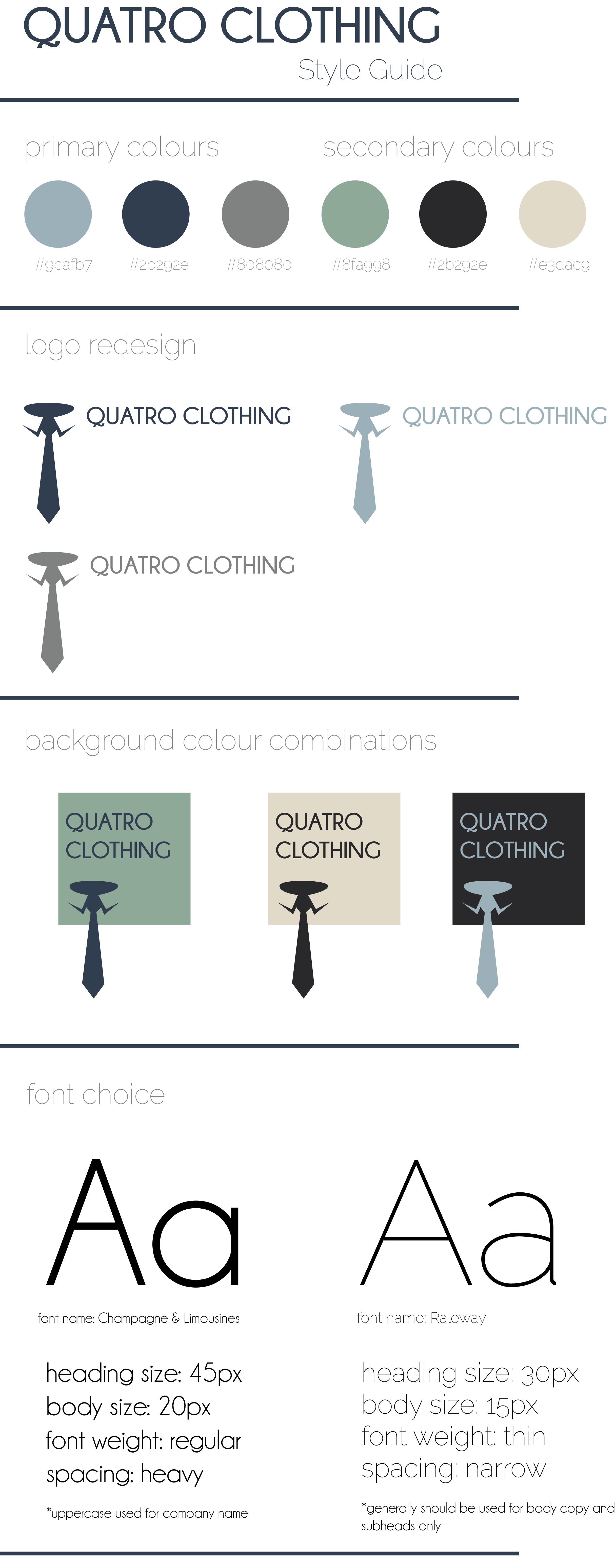
I felt that the logo redesign was effective because it looks cleaner and more high end. The white space shows the illusion of a collar which is important for a clothing store which focuses on high end clothing. I also felt that my colour scheme choices were appropriate because they are manly colours, and look high end because of the navy blue and dark colours. The secondary colours are effective complementary colours which again add to the clean, crisp feel of the style guide. I added a background to some of the logos to show how the colours can be used together. I felt the font choices were effective because they are both clean cut and allow for easy reading. I capitalized the name of the company so that it appears more professional as well as dominant which are qualities that men are likely to look for when looking for a professional clothing company. Using a darker display font and a thinner body font also helps the text to appear more professional.